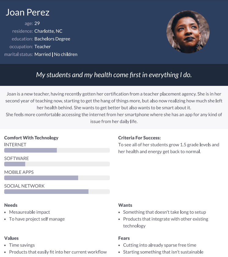
Joan
Joan is a teacher who needs to find good workouts based on their daily schedule because they need to take care of their health and raise energy levels
More than a quarter of the world’s adult population (1.4 billion adults) are insufficiently active;
Worldwide, around 1 in 3 women and 1 in 4 men do not do enough physical activity to stay healthy.
Levels of inactivity are twice as high in high-income countries compared to low-income countries;
There has been no improvement in global levels of physical activity since 2001;
Insufficient activity increased by 5% (from 31.6% to 36.8%) in high-income countries between 2001 and 2016.
Create a mobile and web app that improves people’s lifestyle by engaging them in fitness activities that help them reduce the risk of chronic diseases or improve their overall health.
bFit is part of a health system owned by a European organization that aims to learn people from all categories to have a healthy lifestyle sustained by a fitness schedule, healthy meals, and a better connection with nature.
UX designer leading the app and responsive website design from conception to delivery
Conducting interviews, paper and digital wireframing, low and high-fidelity prototyping, conducting usability studies, accounting for accessibility, iterating on designs, determining information architecture, and responsive design.
October 15th to November 10th, 2021
I have used the data available World Health Organization’s reports to conduct user interviews. Most interview participants know that they should make more physical activities to sustain a healthier lifestyle, but didn’t actively try to do something about it because they either don’t know where to start, or don’t know what exercises to do.
The feedback received through research made it very clear that users would be open to engage in more physical activities, mostly into a fitness schedule, to improve their overall health and sustain a healthy lifestyle if they had access to an easy-to-use tool to guide them through their daily workouts.

Joan is a teacher who needs to find good workouts based on their daily schedule because they need to take care of their health and raise energy levels
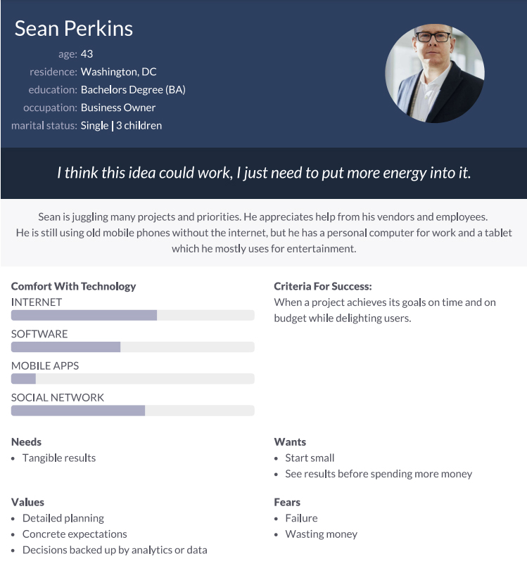
Sean is a business owner who needs to make a workout routine that combines with their busy schedule because they like to stay in good shape and healthy.
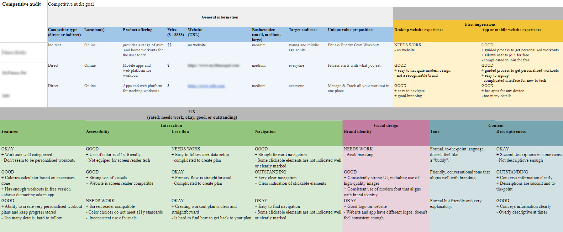
An audit of a few competitors’ products provided direction on gaps and opportunities to address with the bFit app.
I did a quick ideation exercise to come up with ideas for how to address gaps identified in the competitive audit. My focus was specifically on workout plan scheduling and easy to take workouts.
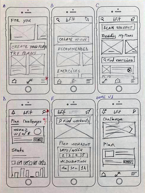
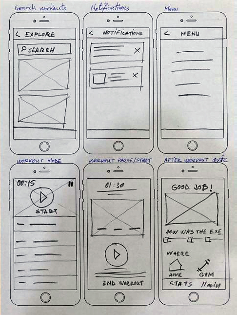
After ideating and drafting some paper wireframes, I created the initial designs for the bFit app. These designs focused on delivering personalized guidance to users to help them create a workout schedule and workout even more when possible.
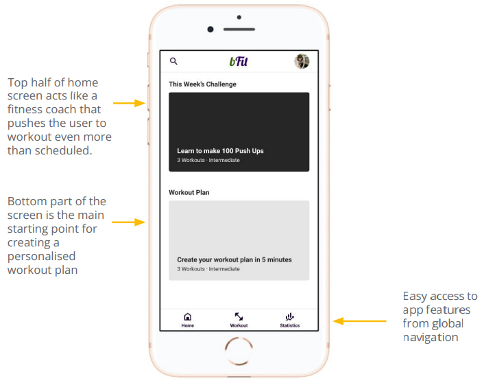
To prepare for testing, I created a low-fidelity prototype. I used this prototype to conduct an unmoderated usability study with 7 participants. Here are the main findings uncovered by the usability study:
People want easy access to create personalised workouts that follows their schedule.
Most people wanted to change the date and time of some specific workouts from their plan.
People with visual impairment wanted to be able to broadcast the workout session on their TV to be able to see the exercises better.
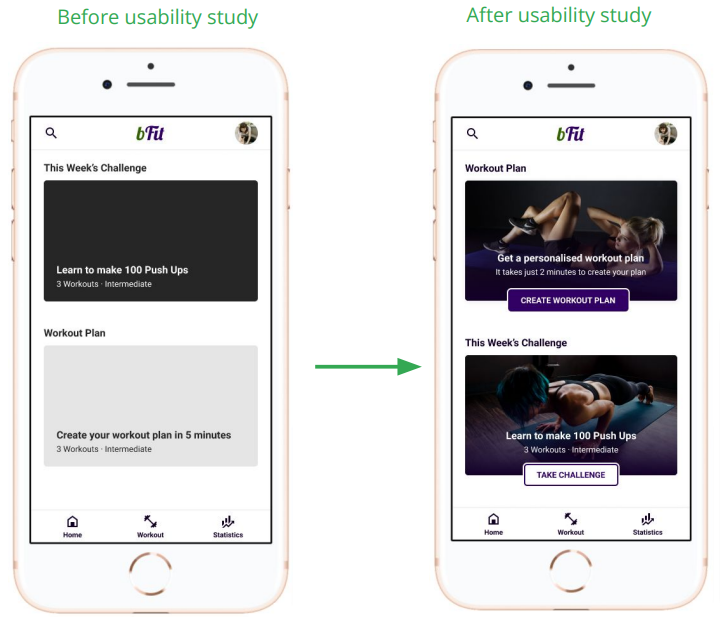
Based on the insights from the usability studies, I applied design changes like providing a clear section from the home screen to create a personalised workout plan or take a recommended challenge.
Additional design changes included adding options to broadcast the workout to smart TVs or to put it on fullscreen to help people with visual impairments see the exercises better.
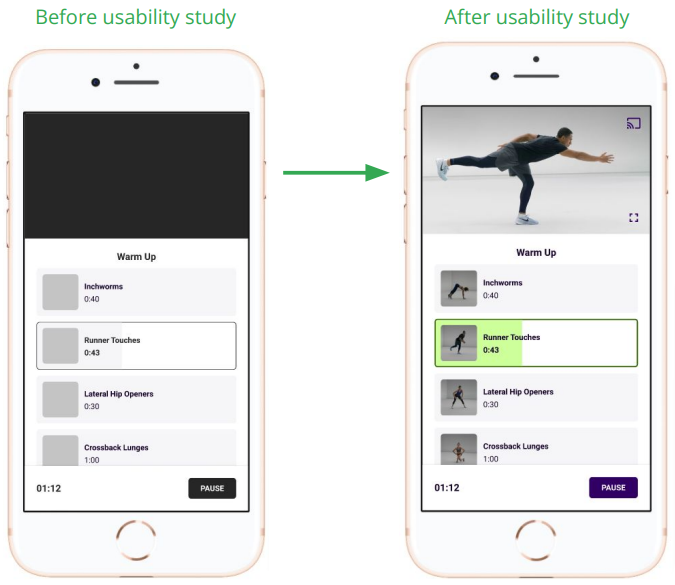


1. Added options to broadcast the workout to smart TVs or to put it on fullscreen to help people with visual impairments see the exercises better.
2. Clear labels for interactive elements that can be read by screen readers.
3. Initial focus of the home screen on personalized recommendations help define the primary task or action for the user.
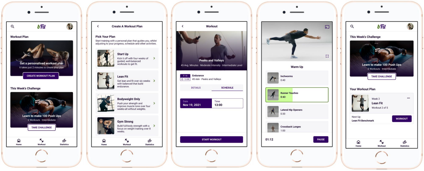
The high-fidelity prototype followed the same user flow as the low-fidelity prototype, including design changes made after the usability study.
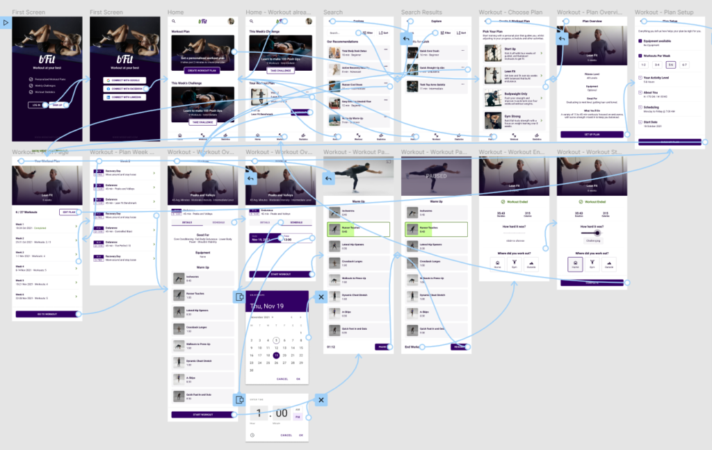
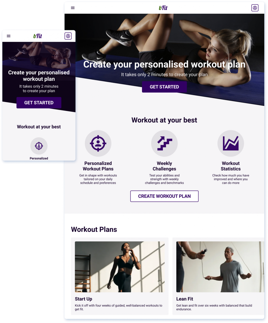
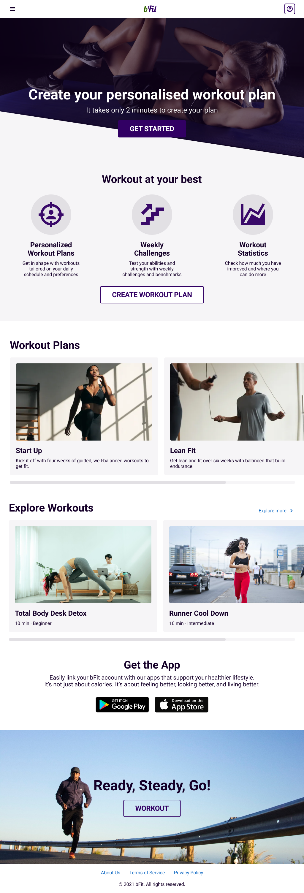
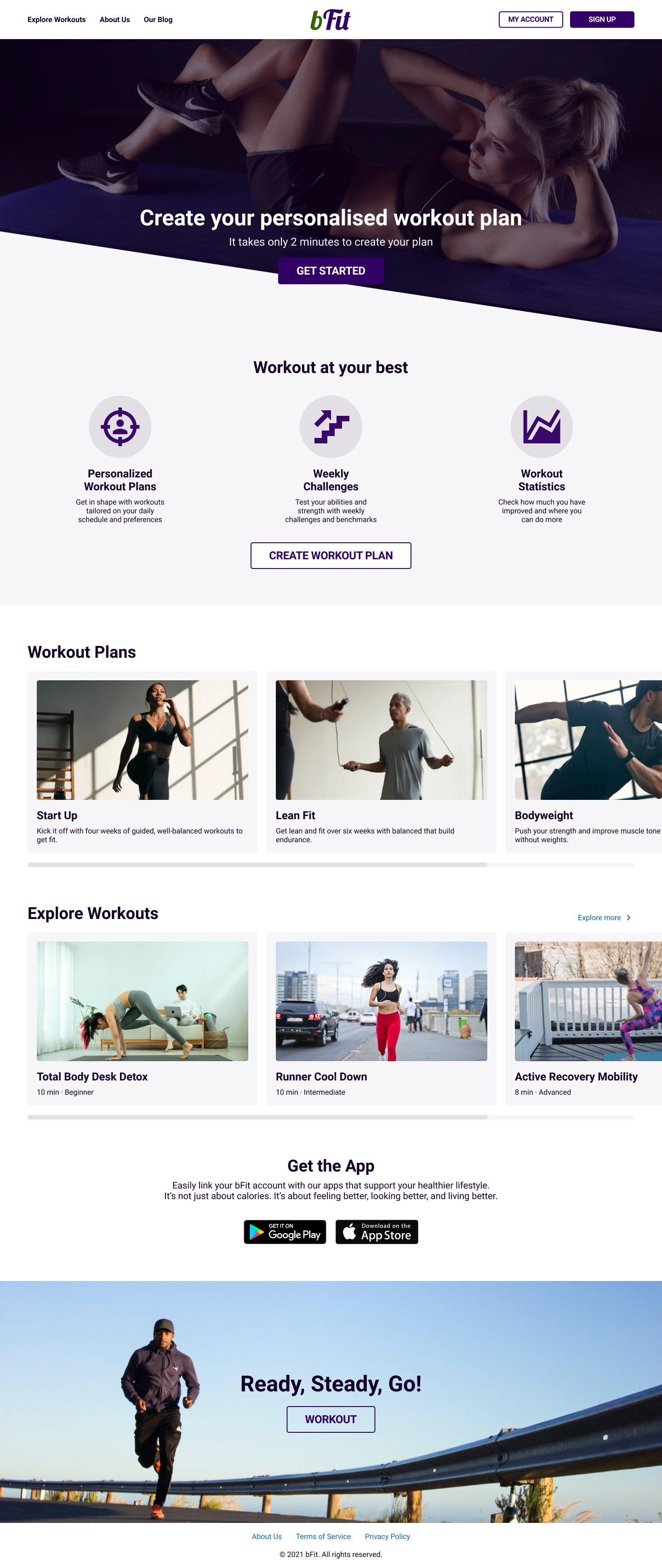
With the app designs completed, I started work on designing the responsive website. I used the bFit sitemap to guide the organizational structure of each screen’s design to ensure a cohesive and consistent experience across devices.
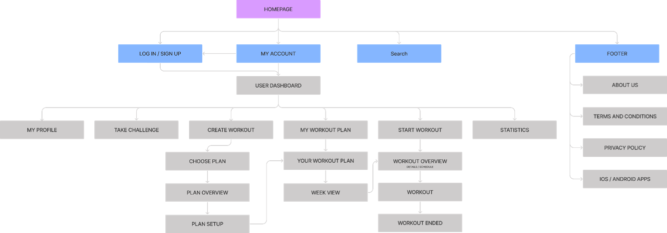
With the app designs completed, I started work on designing the responsive website. I used the bFit sitemap to guide the organizational structure of each screen’s design to ensure a cohesive and consistent experience across devices.

Impact
Clear labels for interactive elements that can be read by screen readers. Users shared that the app makes them workout more. One quote from peer feedback was that “the bFit app can help me get stronger and improve my lifestyle.”
What I learned:
I learned that even though the problem I was trying to solve was a big one, diligently going through each step of the design process and aligning with specific user needs helped me come up with solutions that were both feasible and useful.
1. Research
Conduct research on how successful the app is in reaching the goal to help people make more physical activity.
2. Features
Add more educational resources for users to learn about the benefits of having a good fitness schedule.
3. Rewards
Provide incentives and rewards to users for doing more workout or if they keep their schedule.