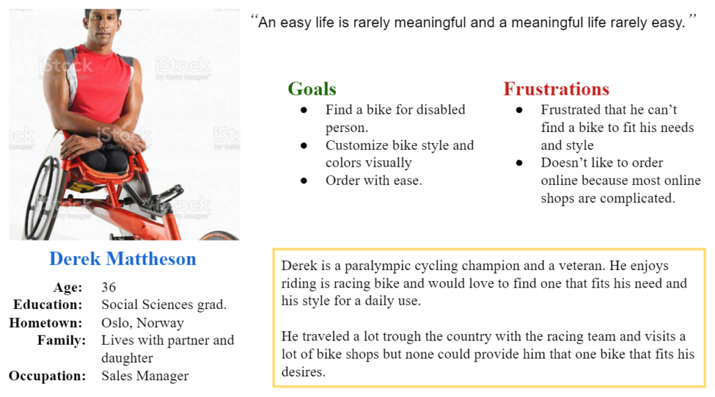
Derek
Derek is a paralympic champion and veteran who needs an wasy way to find and customize a bike based on their needs and style because they like to make outdoor biking.
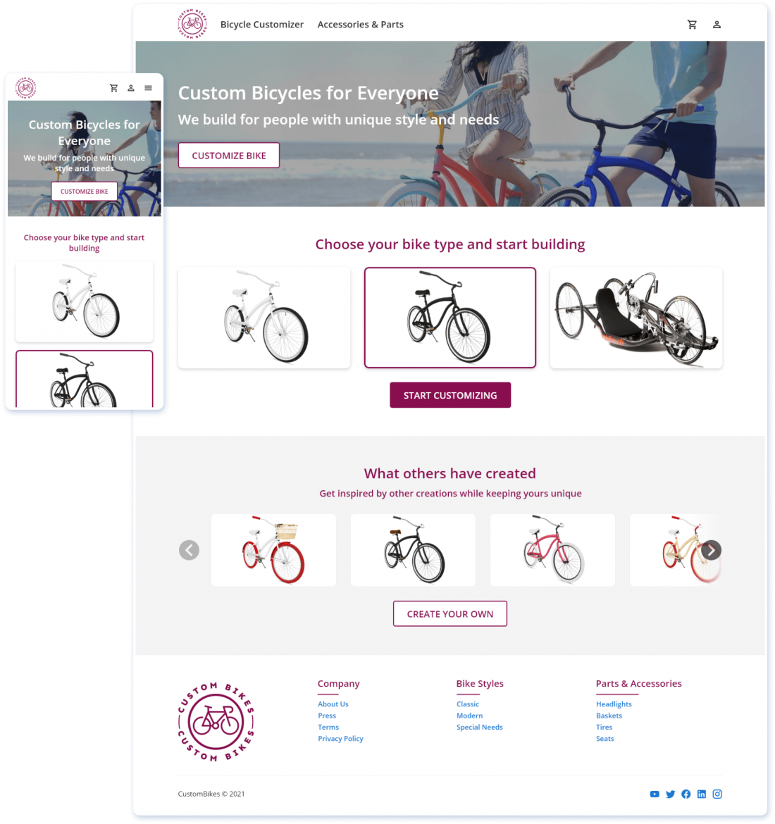
The need of creating a better personal identity has made made people look for more personalized items that they can have. One item they are interested in is a bike customized based on their specifications.
Create a responsive web app that allows people to customize a bike and order it online.
An easy to use web app that allows the user to customize a bike and order it online. The CustomBikes website is owned by a family company that builds customized bycicles for over a decade.
UX designer leading the responsive website design from conception to delivery.
Conducting interviews, paper and digital wireframing, low and high-fidelity prototyping, conducting usability studies, accounting for accessibility, iterating on designs, determining information architecture, and responsive design.
August 1, 2021 to August 24, 2021
I conducted interviews and created empathy maps to understand the users I’m designing for and their needs. A primary user group identified through research were the people with powerful personalities that feel the need to have items that are specially built for them, based on their specifications. This user group revealed other user problems like obligations, interests, or challenges that make it difficult to find bike shops that are willing to make customizations, not even simple ones.

Derek is a paralympic champion and veteran who needs an wasy way to find and customize a bike based on their needs and style because they like to make outdoor biking.
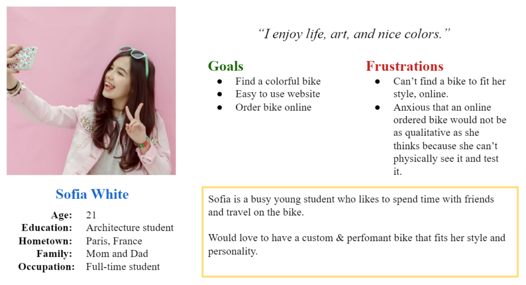
Sofia is a busy young student who needs a personalized bike because they want to have a bike that fits their style and personality.
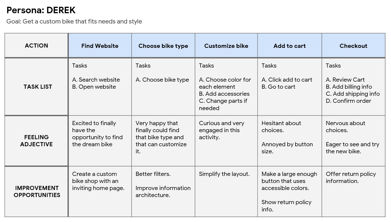
I created a user journey map of Derek’s experience using the site to help identify possible pain points and improvement opportunities.
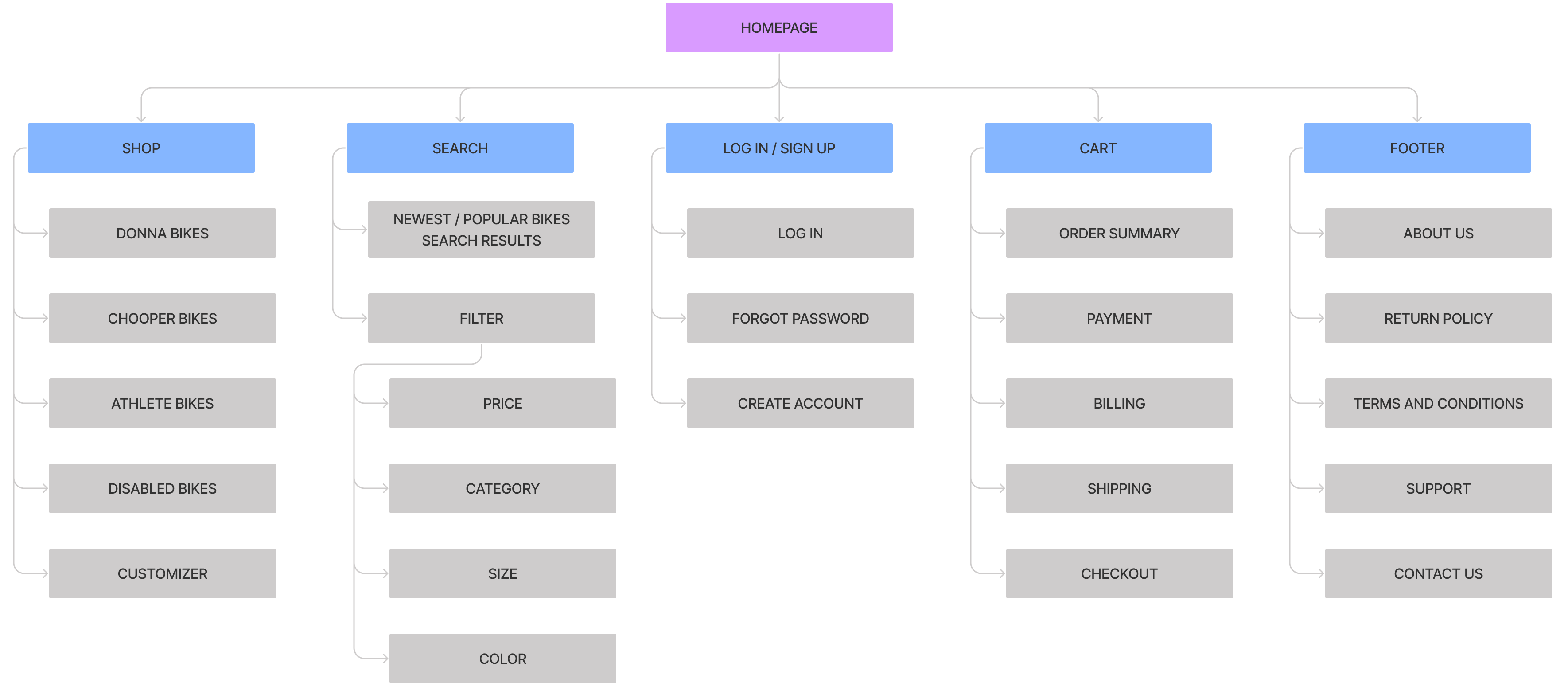
I started work on designing the responsive website by using the sitemap to guide the organizational structure of each screen’s design to ensure a cohesive and consistent experience across devices.
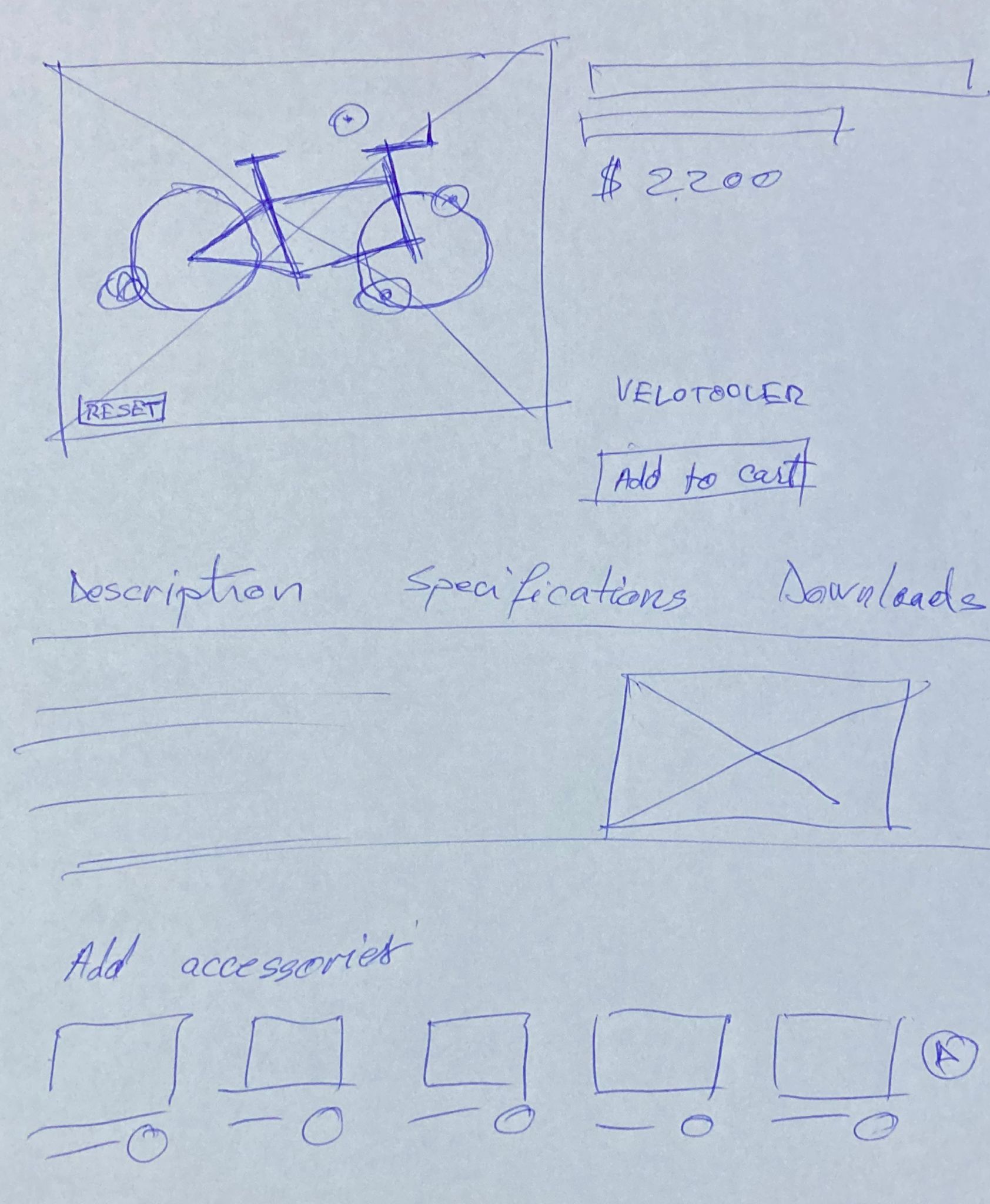
After ideating and drafting some paper wireframes, I created the initial designs for the bFit app. These designs focused on delivering personalized guidance to users to help them create a workout schedule and workout even more when possible.
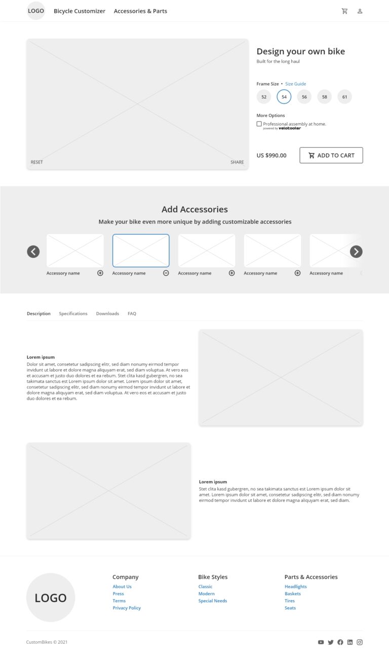
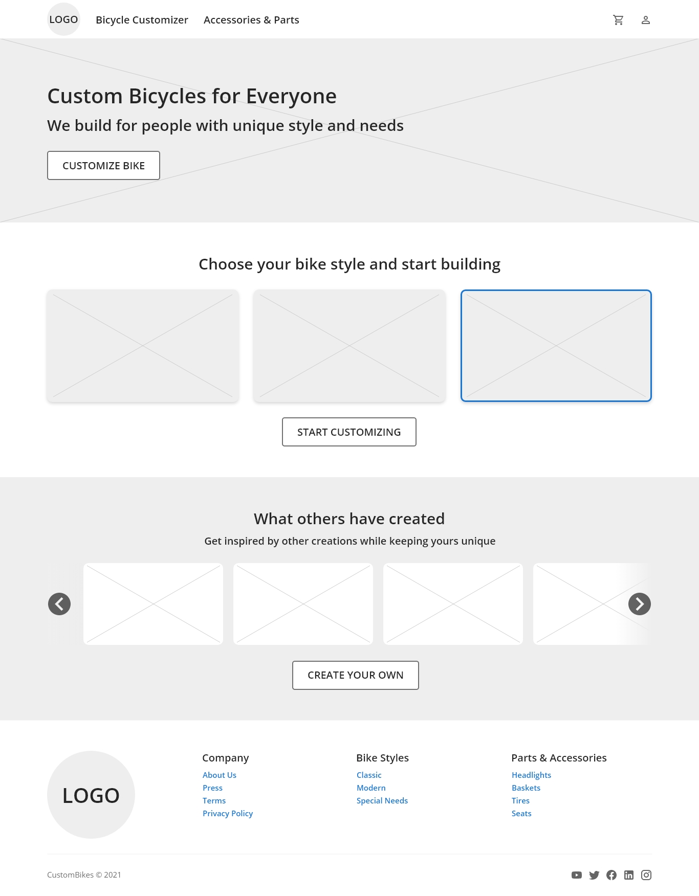

To prepare for testing, I created a low-fidelity prototype. I used the prototype to conduct an unmoderated usability study with 5 participants. Here are the main findings uncovered by the usability study:
Some people were confused by “Start Customizing” button that was not doing anything unless you select an item.
It was unclear for the user how they will be able to customize the bike because we have not shown the bike options.
During the checkout process, there wasn’t a clear way for users to log in to their account to pre-fill previous billing and shipping info.
Based on the insights from the usability studies, I applied design changes like providing a clear section for users to customize the bike.

1. I used headings with different sized text for clear visual hierarchy.
2. I used landmarks to help users navigate the site, including users who rely on assistive technologies.
3. I designed the site with alt text available on each page for smooth screen reader access
The high-fidelity prototype followed the same user flow as the low-fidelity prototype, including design changes made after the usability study.
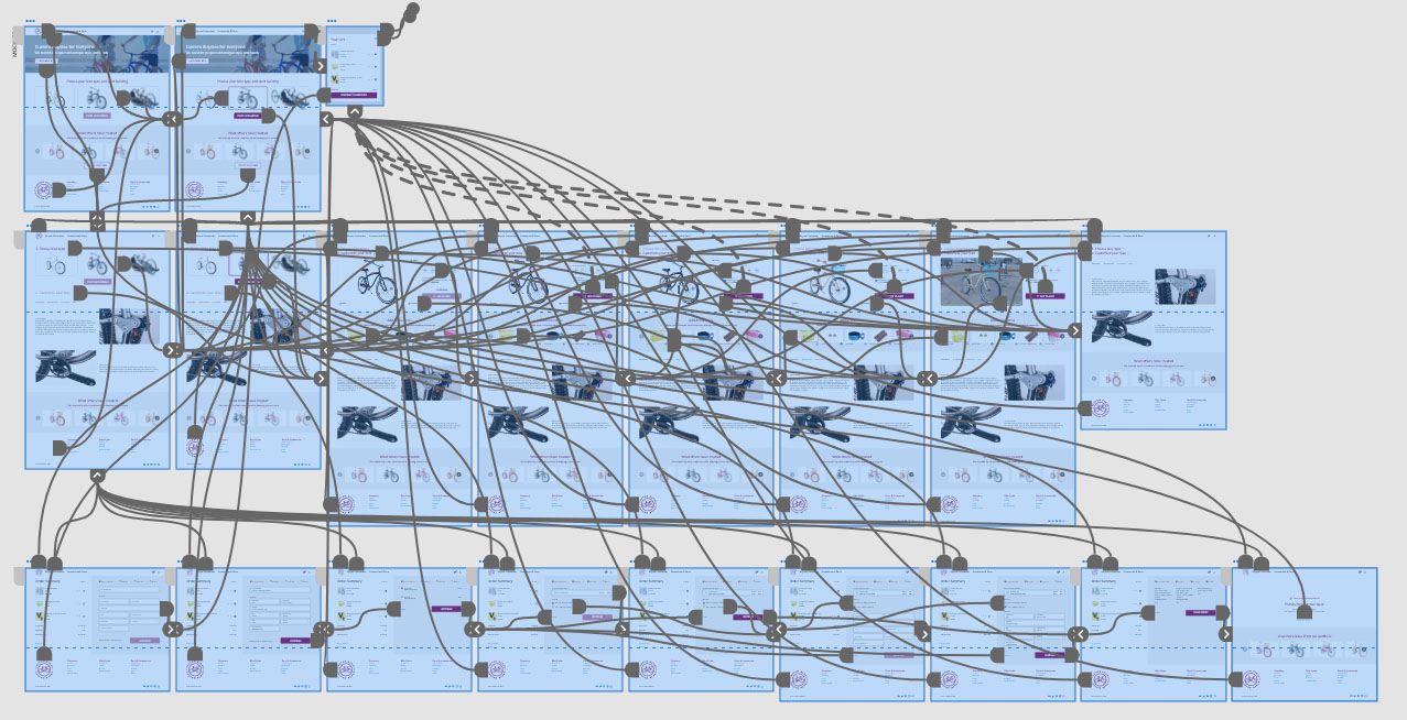
I have made each screen’s design to ensure a cohesive and consistent experience across devices.

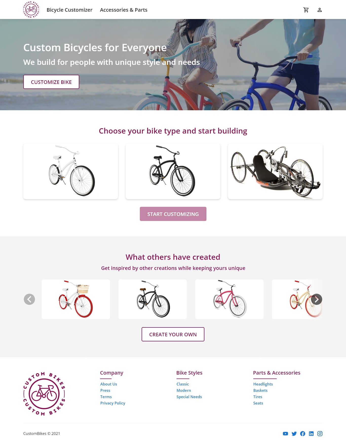
Impact
Users shared that the app makes it very easy for them to find the custom bike they were always looking for. One quote from peer feedback was that “CustomBikes have delivered me an awesome bike which I have personally customized on their website, I love it!”
What I learned:
I learned that even though the problem I was trying to solve was a big one, diligently going through each step of the design process and aligning with specific user needs helped me come up with solutions that were both feasible and useful.
1. Research
Conduct research on how successful the app is in reaching the goal to help people make more physical activity.
2. Features
Find if users might be interested in other types of custom bikes and see if we can add more customization options.
3. Rewards
Provide rewards to users that create the most unique bikes to create more engagement.