Case Study
Fancy Mobile App
Project Overview
The Problem
Some people would like to easily order healthy cooked meals at home or work because they don’t have time to prepare it themselves, nor go to a restaurant, because of their busy schedule.
The Goal
Design an app for Fancy restaurant that allows users to easily order cooked meals.
The Product
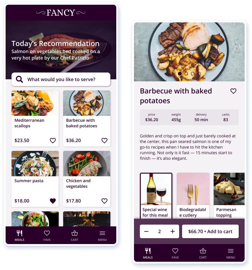
An app made for an elegant restaurant located in the center of Oslo city. The restaurant is preparing high quality dishes and targets customers who’d like to enjoy best cooked meals in the comfort of their home or workspace and don’t have the time to do it themselve.
My Role
UX designer leading the app design from conception to delivery.
Responsibilities
Conducting interviews, paper and digital wireframing, low and high-fidelity prototyping, conducting usability studies, accounting for accessibility, and iterating on designs.
Project Duration
April to July 2021
Understanding the User
I conducted interviews and created empathy maps to understand the users I’m designing for and their needs. A primary user group identified through research were the busy people who don’t have time to cook meal. This user group revealed other user problems like obligations, interests, or challenges that make it difficult to get groceries for cooking or go to restaurants in-person.
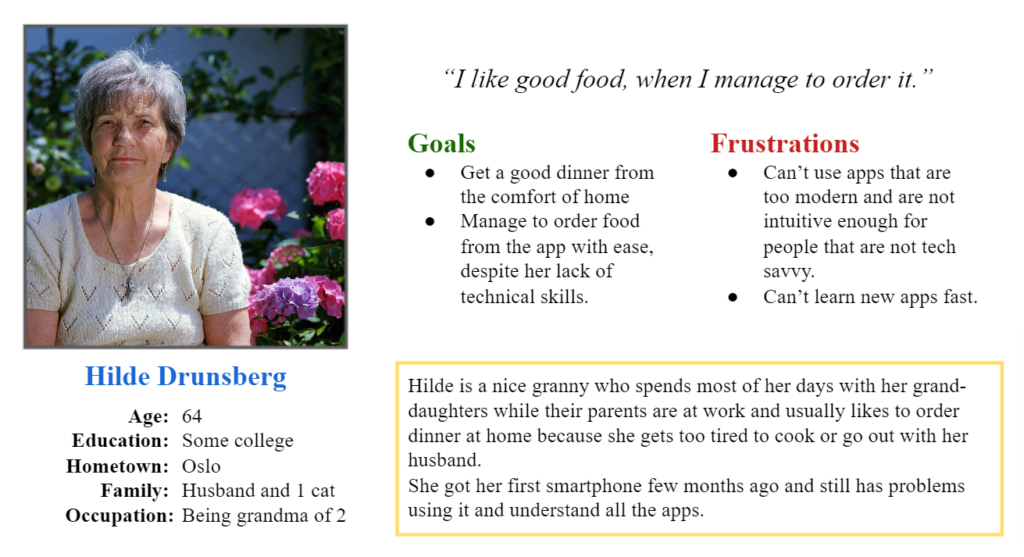
Personas & Problem Statements
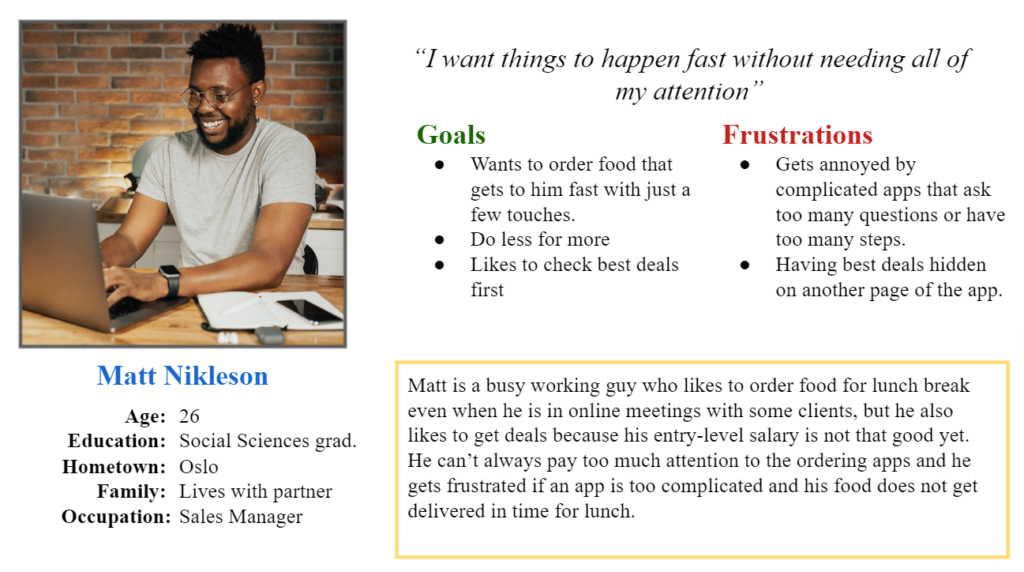
Matt
Matt is a busy worker who needs to find a way to order a good and healthy lunch because does not have time to go at the restaurant in the lunch break.
Competitive Audit
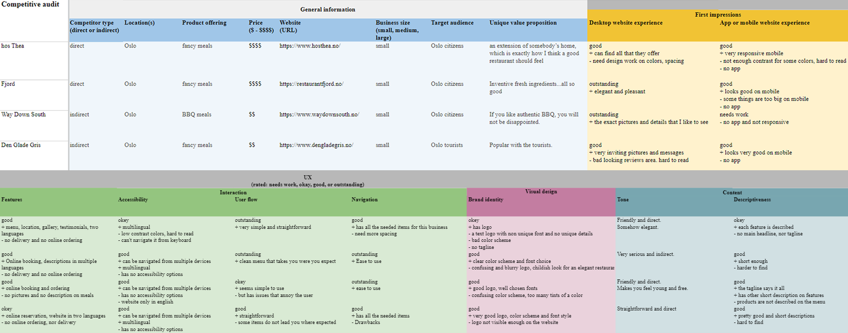
An audit of a few competitors’ products provided direction on gaps and opportunities to address with the Fancy app.
Ideation
I did a quick ideation exercise to come up with ideas for how to address gaps identified in the competitive audit. My focus was specifically on finding meals and order them.
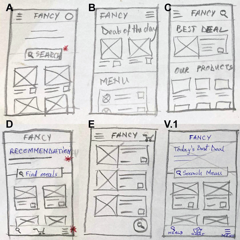
Starting the design
Digital Wireframes
After ideating and drafting some paper wireframes, I created the initial designs for the Fancy app. These designs focused on delivering an easy way for users to find meals and order it at home or work. Easy navigation was a key user need to address in the designs in addition to equipping the app to work with assistive technologies.
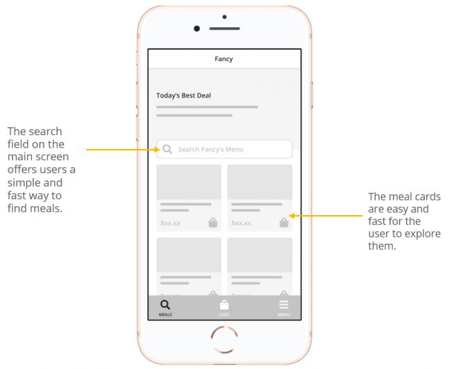
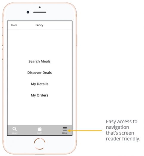
Usability study findings
To prepare for testing, I created a low-fidelity prototype. I used this prototype to conduct an unmoderated usability study with 5 participants. Here are the main findings uncovered by the usability study:
Options
User wants multiple addresses option to change between them when needed.
Checkout
The checkout process was confusing for some participants. They could not see the delivery details with ease.
Favorite
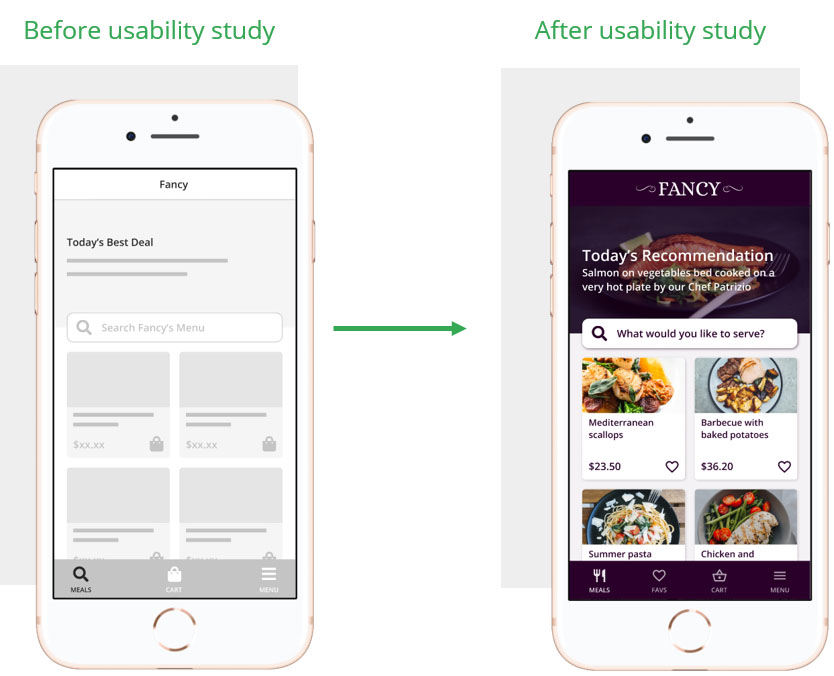
Some users were looking for a way to keep the meals they found to order later. “Add to favorites” option needed.
Refining the design
Mockups
The first usability study revealed the fact that most users want to add multiple addresses(*home, work etc) and for this reason I have created a page where users can create more addresses and change between them as needed.
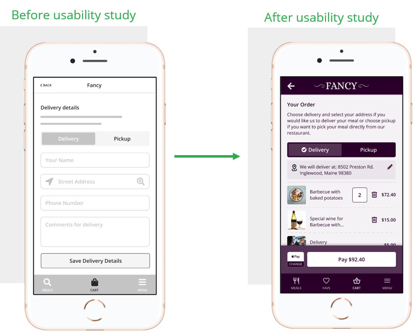
The second usability study revealed frustration about the fact the the user has to search every day for the meals that they like most, therefore I have replaced the cart icon on meal cards with a heart icon so they can add the meals to “Favorites”.


Accessibility Considerations
1. Provided access
to users who are vision impaired through adding alt text to images for screen readers.
2. Used icons to help make navigation easier. Improved colors based on WebAIM to follow WCAG AAA guidelines.
3. Used detailed imagery for meals and meal options to help all users better understand the designs.
Refined Designs
High-Fidelity Prototype
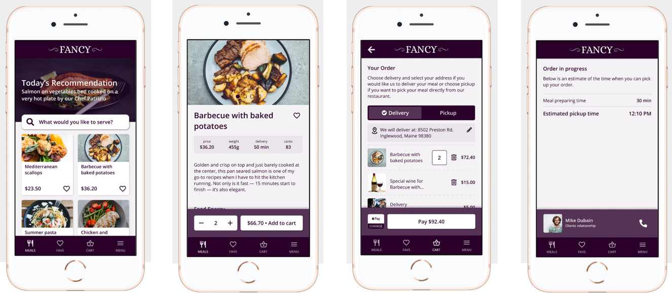
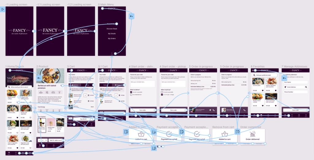
The high-fidelity prototype followed the same user flow as the low-fidelity prototype, including design changes made after the usability study.
Going Forward
The Goal
Impact
The app makes users feel like “Fancy” app really thinks about how to meet their needs and expectations.
One quote from feedback: “I am astound of how easy was to get a healthy meal with this app, I will definetly use it again.”
What I learned:
While designing “Fancy” app, I learned that the first ideas for the app are only the beginning of the process. Usability studies and peer feedback influenced each iteration of the app’s designs.
Next Steps
1. Research
Conduct another round of usability studies to validate whether the pain points users experienced have been effectively addressed.
2. Features
Conduct more user research to determine any new areas of need.
3. Design
Iterate on the high fidelity designs and test different layouts to find if there is room for improvements.
